What Is RSI Heatmap
RSI Heatmap is a tool that displays RSI (Relative Strength Index) values for all tracked trading pairs simultaneously, on a single screen. Instead of opening hundreds of charts one by one, you can see the entire cryptocurrency market as a single color-coded canvas.
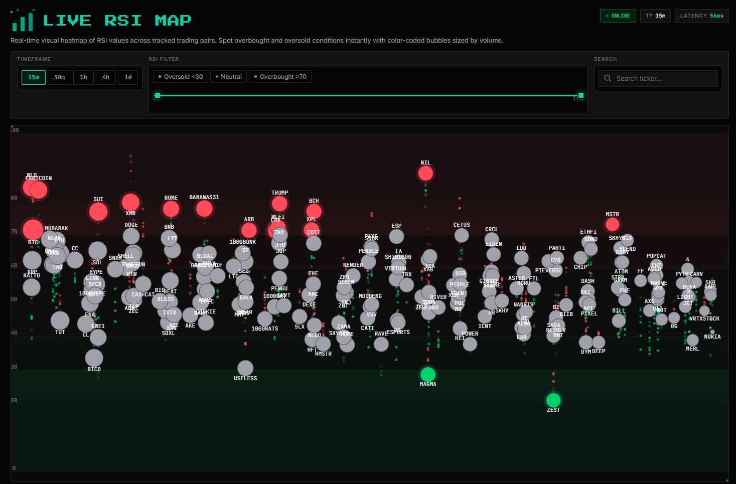
Each bubble on the map represents a trading pair. The larger the bubble, the higher the trading volume for that instrument. The color shows the current RSI value:
- Red shades — RSI above 70, the asset is overbought. Rapid growth, a pullback may be possible.
- Green shades — RSI below 30, the asset is oversold. Strong decline, a rebound may be possible.
- Gray — neutral zone (RSI 30–70), the market is in balance.
This visualization allows you to assess the "temperature" of the market in seconds: where it's hot, where it's cold, and where there may be potential for a move.
How the Heatmap Works
RSI (Relative Strength Index) is one of the most popular oscillators in technical analysis. It measures the speed and magnitude of price changes, scaling the result to a range from 0 to 100.
The classic interpretation is:
| Zone | RSI | Signal |
|---|---|---|
| Oversold | < 30 | The asset has fallen too quickly; an upward reversal may be likely |
| Neutral | 30–70 | No significant imbalance; the market is in balance |
| Overbought | > 70 | The asset has risen too quickly; a downward correction may be likely |
The heatmap displays RSI values for all pairs in real time (updated when each candle closes). Select a timeframe — 15m, 30m, 1h, 4h, or 1d — to see the current market picture for your chosen horizon.
How to Use RSI Heatmap
1. Selecting a Timeframe
The timeframe switching buttons are located below the heading. The shorter the timeframe (15m), the more market noise there is and the faster the signals change. The longer the timeframe (1d), the more reliable the overall picture tends to be, but the fewer entry opportunities there are.

For scalping and intraday trading, 15m and 30m are convenient. For swing trading, use 1h and 4h. For macro trend analysis, use 1d.
2. Filtering by RSI Zones
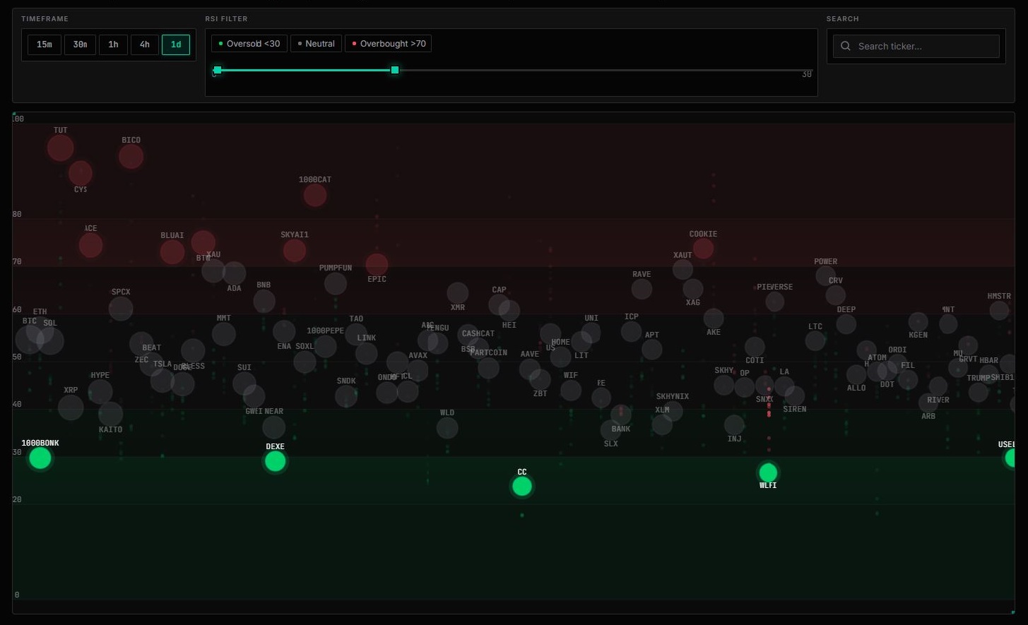
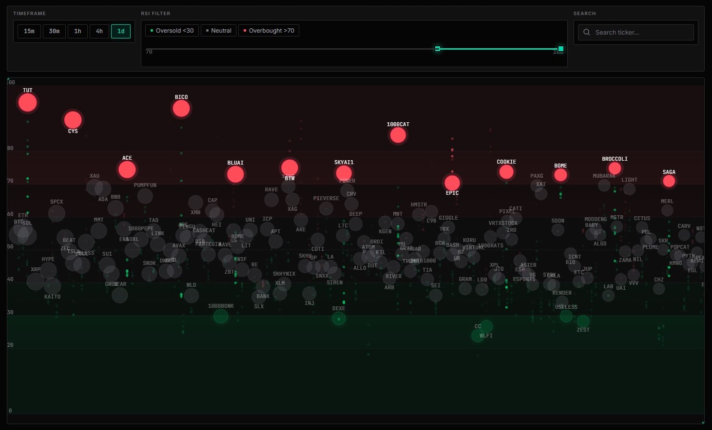
Three filter buttons allow you to focus on the asset group you need:
- Oversold <30 — show only oversold pairs. These are potential candidates for buying (a rebound from oversold conditions).
- Neutral — show all pairs without filtering.
- Overbought >70 — show only overbought pairs. These are candidates for selling or taking profits.
3. Searching by Symbol
The search field allows you to quickly find a specific pair (for example, BTC, ETH, or SOL) and check its current RSI across all timeframes.
How to Find Trades Using RSI Heatmap
The heatmap is a market-scanning tool, not an automated trading robot. Here is a practical workflow:
Step 1: Look for Extreme Zones
Open the Oversold <30 or Overbought >70 filter. Assets in these zones are candidates for further analysis. The farther RSI moves from the neutral zone, the stronger the "overheating" or "overcooling" of the asset.
Step 2: Check Multiple Timeframes
Switch between timeframes. If an asset is oversold on both 1h and 4h, this is a more reliable signal than oversold conditions on 15m alone. Convergence (alignment) of signals across multiple timeframes increases the probability of a reversal.
Step 3: Consider Volume
The bubble size represents trading volume. Large bubbles in an extreme zone represent large, liquid assets where reversals are generally more predictable. Small bubbles with extreme RSI on low-volume pairs can produce false signals — their price is easier to manipulate.
Step 4: Confirm on the Chart
RSI Heatmap tells you where to look, but not when to enter. Once you find an interesting asset, open its chart and check:
- Is there a support or resistance level near the current price?
- Is there a divergence between price and RSI? You can use our Divergence Radar tool for this.
- Does a candlestick pattern confirm a potential reversal? — Check TA Patterns.
Why the Heatmap Is Useful
- Fast market scanning. You can see 200 pairs at a glance instead of spending an hour clicking through charts.
- Objectivity. Color coding removes emotions from the equation — green means oversold, red means overbought, regardless of your expectations.
- Anomaly detection. The brightest bubbles on the map represent assets with the most extreme RSI values. These are often the assets that produce the sharpest rebounds or corrections.
- Asset comparison. It is easy to see which sectors or individual coins are weaker or stronger than the overall market.
- Real-time analysis. Values are updated whenever a candle closes, so you are always working with current data.
Conclusion
RSI Heatmap is the first step in a trader's workflow: quickly scan the market, filter out the noise, and focus on assets with genuine potential for a move. Combine it with Divergence Radar to confirm reversals, Pump & Dump Detector to monitor sharp price movements, and TA Patterns to identify classic chart patterns.
The heatmap won't tell you when to press the "Buy" button. But it can save you dozens of minutes every day and help you avoid missing opportunities hidden among hundreds of trading pairs.
Comments