Pump & Dump Detector: A Practical Guide to Reading Crypto Market Phases
Crypto markets rarely move in a straight line. A coin can sit quietly for hours, attract unusual volume, accelerate into a pump, and then lose momentum before most traders even notice. The hard part is not finding a green candle — it is understanding where that move sits in the larger market cycle.
That is what the Pump & Dump Detector is built for. It scans live crypto signals and combines price action, RSI, volume, acceleration, volatility, relative strength versus BTC, candlestick patterns, and divergence into one readable dashboard.
This guide walks through the tool from top to bottom: what each phase means, how to use every filter, how to open a signal, and how to turn the dashboard into a repeatable research workflow.
Important: The detector is a market-scanning and decision-support tool, not a promise of future returns. Treat every signal as a starting point for analysis. Confirm it on the chart, manage risk, and never trade solely because a coin has a high score.
What is the Pump & Dump Detector?
The Pump & Dump Detector is a live crypto market scanner for USDT pairs. Instead of showing only the biggest percentage gainers, it tries to describe the stage of a move:
- Accumulation (Wyckoff) — price is relatively quiet while activity and positioning may be building.
- Early Momentum — the move is beginning to pick up; acceleration or volume can be more useful than the raw price change.
- Pump Active — the move is already strong. The sub-phase may show whether it is accelerating or peaking.
- Exhaustion — momentum may be losing quality after an extended move.
- Dump — downside pressure is dominating. The interface can also label the sub-phase as dump active or a possible bounce.
The page updates live and displays the current number of tracked signals. At the time of writing, the dashboard shows up to 200 live signals, while the table can be paginated for a more comfortable view.

Start with the big picture
When you open the tool, do not immediately jump to the first ticker. Start with three questions:
- Which phases are currently populated?
- Are signals isolated to a few coins or spread across the market?
- Does the move look early, active, or late?
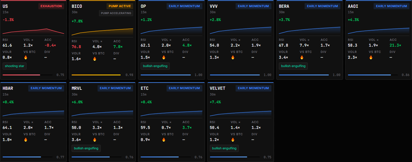
The statistics row gives a quick overview of the current feed: total signals and the approximate distribution between Accumulation, Early Momentum, Pump Active, Exhaustion, and Dump Active. This is useful context. A market full of early-momentum signals feels very different from one dominated by exhaustion signals, even if both have coins showing green price changes.
The Priority section highlights top signals so you can see the strongest or most interesting examples without scanning the entire table. It is a good place to learn how the labels behave in real time.
Understanding the metrics
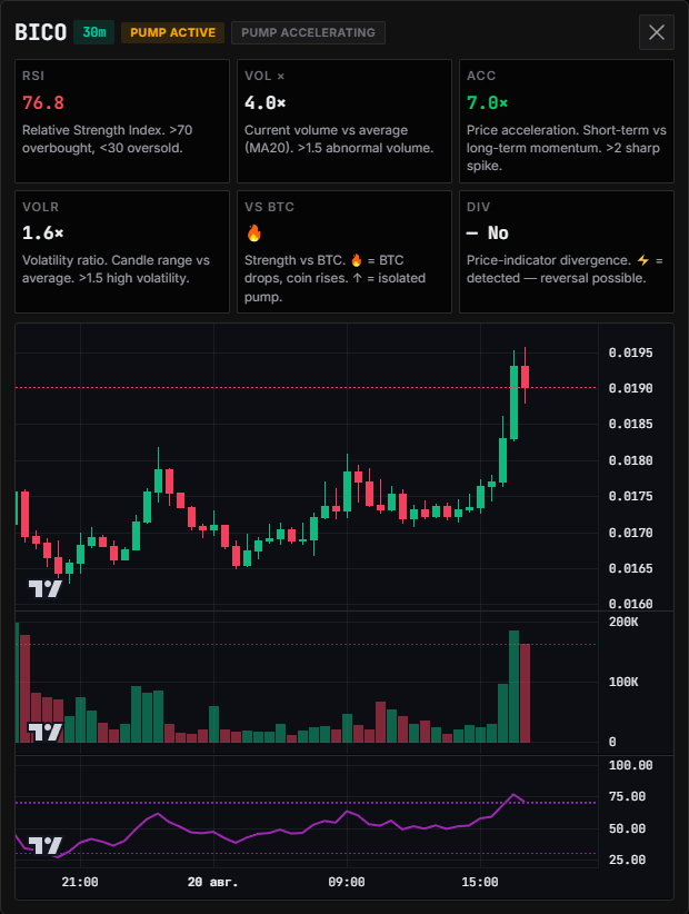
Click any priority card or table row to open its details. The modal explains the numbers in plain language, which makes it useful even if you are still getting comfortable with technical indicators.
RSI
RSI, or Relative Strength Index, measures recent momentum on a 0–100 scale. The detector highlights readings above 70 as potentially overbought and readings below 30 as potentially oversold.
RSI is not a sell or buy button. A coin can remain above 70 during a powerful trend, and a low RSI can stay low during a real dump. Use it as context: a high RSI combined with Pump Active or Exhaustion deserves more caution than a high RSI during a fresh, orderly breakout.
VOL ×
VOL × compares current volume with its moving average. A reading of 4.0×, for example, means the current volume is roughly four times the reference average. The interface describes readings above about 1.5× as abnormal volume.
Unusual volume can validate attention, but it does not tell you whether buyers or sellers will win. Pair it with the phase, price change, and candle structure.
ACC
ACC represents price acceleration: short-term momentum compared with longer-term momentum. Values above 2 can indicate a sharp spike.
This is one of the most useful fields for separating a slow grind from a sudden move. A coin with moderate price change but very high acceleration may be at an interesting transition point — or may already be becoming too extended.
VOLR
VOLR is the volatility ratio. It compares the current candle range with the average range. A reading above roughly 1.5 means the market is moving with higher-than-usual volatility.
High volatility is a warning to adjust expectations and position size. It can create opportunity, but it can also make stops easier to hit.
VS BTC
The VS BTC field shows how the coin is behaving relative to Bitcoin. The fire icon indicates relative strength when BTC is dropping while the coin is rising; an upward marker indicates a more isolated pump.
Relative strength is especially helpful when the overall market is choppy. A coin moving up only because the whole market is moving up is a different setup from a coin holding firm while BTC weakens.
DIV
DIV flags a price–indicator divergence when one is detected. The lightning icon means divergence is present, which can warn that the current move is losing alignment with momentum.
Divergence is not an instant reversal signal. It is a reason to slow down, inspect the chart, and look for confirmation. For deeper divergence research, you can also use the Divergence Radar elsewhere on CoinPulseTools.
How to use every filter
The filter bar is designed for progressively narrowing the feed. You can combine filters rather than choosing only one.
1. Phase
The phase filter includes All phases, Exhaustion, Pump active, Early Momentum, Accumulation (Wyckoff), and Dump.
Use it like this:
- Choose Early Momentum when you want to study moves that may still be developing.
- Choose Pump active when you want to monitor already-strong moves and possible acceleration or peaking.
- Choose Exhaustion to find moves where chasing may be especially risky.
- Choose Dump to monitor downside pressure and possible dump-active setups.
- Choose Accumulation (Wyckoff) for quieter situations where the move has not yet become obvious.
- Return to All phases for a complete market scan.
The phase is a description of current conditions, not a prediction. A coin can move from one phase to another as new candles arrive.
2. Timeframe
The timeframe buttons are 15m, 30m, 1h, and 4h. They can be selected independently, so you can compare several horizons at once or temporarily switch one off.
A practical approach is to begin with 1h and 4h for context, then add 15m or 30m to investigate timing. Shorter timeframes produce more responsive signals but also more noise. Longer timeframes are slower and may help filter out a brief wick or one-candle spike.
3. Score
The score filter lets you show signals above 0.5, 0.6, 0.7, or 0.8, or leave it at Any.
A higher score is a useful way to reduce the list, but it should not be confused with probability or guaranteed performance. Use a high threshold when you want a compact shortlist; use Any when you are learning the dashboard or looking for weaker, earlier examples.
4. Pattern and divergence
With pattern keeps only signals that include a detected candlestick pattern, such as bullish engulfing, doji, shooting star, or dragonfly doji. Patterns add a visual clue, but their meaning depends on location and context.
With divergence keeps only signals where the detector has flagged divergence. This is a useful filter when your goal is to find potential momentum disagreement rather than chase strength.
You can combine them with a phase and score. For example, Exhaustion + With divergence is a focused way to look for moves that may be running out of steam.
5. Market
The market filter has three modes:
- All — show the full feed.
- Isolated — focus on signals that are not simply part of a broad market wave.
- Market wave — focus on moves that appear connected to wider market behavior.
If the market is moving together, Market wave can help you study the broader push. If you want coins showing independent strength or weakness, try Isolated. The exact number of results can change quickly because this is a live feed.
6. Search
Use Search ticker to find a specific pair. Type a symbol such as BICO and the table narrows to the matching instrument. This is handy when you have already noticed a coin elsewhere and want to check its current phase and supporting metrics.
Clear the search field to return to the selected filters.
7. Rows and pagination
The table can show 25 or 50 rows per page. The arrows move between pages. Choosing 25 keeps the table easier to read; choosing 50 is faster when you are doing a broad scan.
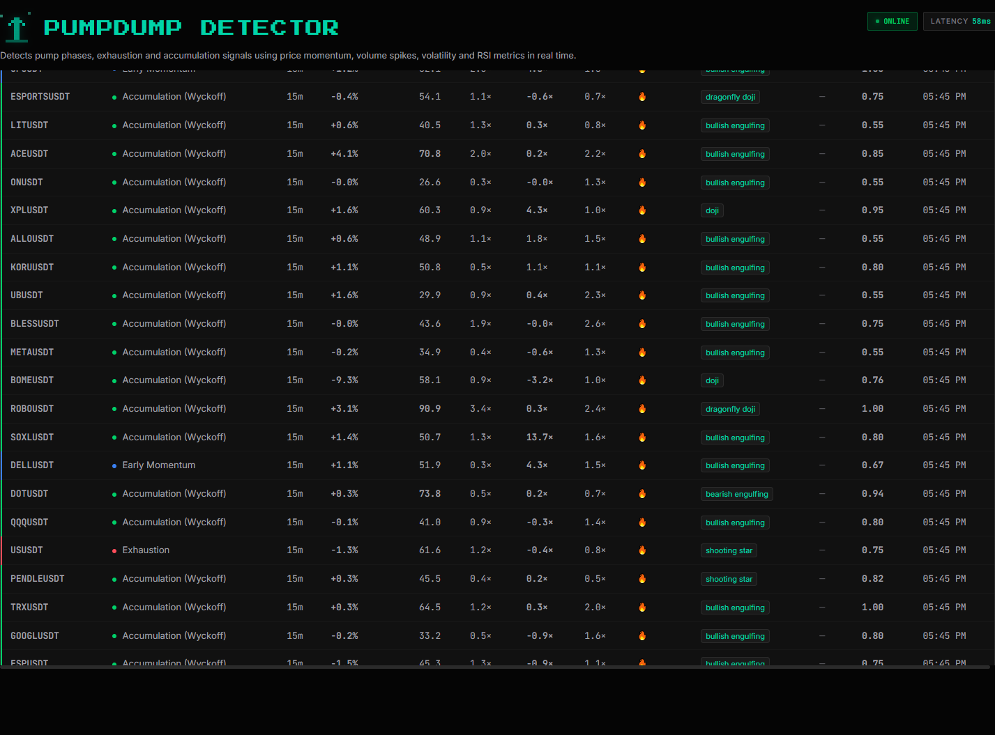
The table columns include coin, phase, timeframe, price change, RSI, volume multiple, acceleration, volatility ratio, relative strength, pattern, divergence, score, and time. Read across the row rather than focusing on a single green or red number.
A simple workflow for real analysis
Here is a repeatable five-minute routine:
- Open the Pump & Dump Detector and check the phase distribution.
- Start with 1h and 4h to avoid being trapped by very short-term noise.
- Pick a goal: early momentum, active pumps, exhaustion, dumps, or accumulation.
- Set a score threshold such as
> 0.7to create a manageable shortlist. - Add With pattern or With divergence only when it matches your question.
- Compare RSI, VOL ×, ACC, and VOLR. Look for a coherent story instead of one exciting metric.
- Open the most interesting card and read the explanations in the modal.
- Check the chart and liquidity on your exchange before considering any trade.
- Define invalidation, stop placement, and position size before entering.
For example, a Pump Active signal with RSI 76.8, volume 4.0×, acceleration 7.0×, and volatility ratio 1.6× is clearly energetic — but it may also be late and stretched. The correct response is not automatically “buy.” It may be “wait for a pullback, inspect structure, or skip it.”
Common mistakes to avoid
Chasing the biggest percentage move
A large green number often means that the easy part of the move has already happened. Check the phase and acceleration before assuming there is still room to run.
Treating the score as a guarantee
The score helps rank signals. It does not remove market risk, slippage, liquidity issues, or sudden news.
Ignoring timeframe conflict
A 15m Early Momentum label can exist inside a 4h Exhaustion context. When timeframes disagree, reduce size or wait for a clearer structure.
Reading volume without price action
A volume spike can appear during accumulation, a breakout, a liquidation cascade, or a reversal. Volume is information, not direction by itself.
Forgetting that live data changes
A signal is a snapshot of current conditions. As new candles close, its phase, score, and metrics can change. Always re-check the instrument before acting.
Final thoughts
The Pump & Dump Detector is most useful when you treat it as a market map, not a signal vending machine. It helps you move from “what is moving?” to better questions: Is this move early or late? Is volume supporting it? Is price accelerating? Is it strong against BTC? Is momentum diverging?
Use the filters to turn a noisy crypto market into a focused research list. Use the cards and modal to understand the evidence behind each label. Then confirm the idea with your own chart analysis and risk plan.
That combination — live scanning plus disciplined confirmation — is where the tool becomes genuinely useful for everyday crypto research.
This article is for educational purposes only and is not financial advice.
Comments